Diagnostics guide
After fitting a mixed model, diagnostics help you check whether the model assumptions hold and whether any observations are unduly influencing the estimates.
This guide covers:
Residuals — marginal vs conditional, what patterns to look for
Leverage — which observations have high potential influence
Cook’s distance — which observations actually change the fixed-effect estimates
MDFFITS — standardised version of Cook’s D, scale-free
COVTRACE and COVRATIO — influence on the precision of fixed-effect estimates
Relative variance change (RVC) — influence on variance components
hlm_augment— combining everything into one tidy DataFrameWorked example — introducing an outlier and watching the diagnostics react
Throughout we use synthetic exam-score data: students and schools as crossed grouping
factors, with hours_studied and prior_gpa as fixed predictors.
import numpy as np
import pandas as pd
import interlace
from interlace import hlm_resid, leverage, hlm_influence, hlm_augment, isSingular
from plotnine import (
    ggplot, aes,
    geom_point, geom_hline, geom_vline, geom_histogram, geom_qq, geom_qq_line,
    geom_text, geom_segment,
    scale_color_manual,
    labs, theme_bw, theme, element_text,
    facet_wrap,
)

rng = np.random.default_rng(42)
n = 300

df = pd.DataFrame({
    "score":         60 + rng.normal(0, 8, n),
    "hours_studied": rng.uniform(0, 10, n),
    "prior_gpa":     rng.uniform(2.0, 4.0, n),
    "student_id":    [f"s{i}"   for i in rng.integers(1, 31, n)],
    "school_id":     [f"sch{i}" for i in rng.integers(1, 11, n)],
})

result = interlace.fit(
    "score ~ hours_studied + prior_gpa",
    data=df,
    groups=["student_id", "school_id"],
)
/tmp/ipykernel_2472/179038553.py:25: UserWarning: boundary (singular) fit: see help(interlace.isSingular)
0. Singular fit check
Before running any diagnostics, check whether the model is at the boundary of its parameter space. A singular fit means one or more variance components collapsed to zero. This can make residual patterns and influence measures harder to interpret.
from interlace import isSingular

print(f"Singular fit: {result.is_singular}")
print(f"Boundary flags: {result.boundary_flags}")

if isSingular(result):
    print("\nWarning: one or more variance components are at the boundary.")
    print("Fixed-effect SEs and influence measures may be unreliable.")
    print("Consider dropping the flagged grouping factor or using optimizer='bobyqa'.")
Singular fit: True
Boundary flags: {'student_id': False, 'school_id': True}

Warning: one or more variance components are at the boundary.
Fixed-effect SEs and influence measures may be unreliable.
Consider dropping the flagged grouping factor or using optimizer='bobyqa'.
1. Residuals
interlace.hlm_resid() returns either marginal or conditional residuals.
Type |
Formula |
Interpretation |
|---|---|---|
Marginal |
|
Deviation from the population-level prediction (ignoring BLUPs) |
Conditional |
|
Deviation from the group-specific prediction (using BLUPs) |
Use marginal residuals to check the fixed-effect structure and the overall distributional assumption (normality of the response given predictors). Use conditional residuals to check within-group model fit and to spot individual outliers after accounting for group membership.
Both types should show:
No trend against fitted values (homoscedasticity)
Approximate normality (check with a Q–Q plot)
No systematic pattern by group
marginal = hlm_resid(result, type="marginal")      # y - Xβ
conditional = hlm_resid(result, type="conditional")  # y - Xβ - Zû

resid_df = pd.DataFrame({
    "fitted":      conditional[".fitted"],
    "marginal":    marginal[".resid"],
    "conditional": conditional[".resid"],
})

resid_df.describe().round(3)
| fitted | marginal | conditional | |
|---|---|---|---|
| count | 300.000 | 300.000 | 300.000 |
| mean | 59.671 | 0.012 | -0.000 |
| std | 1.433 | 7.437 | 6.983 |
| min | 56.371 | -20.175 | -18.764 |
| 25% | 58.794 | -5.108 | -4.713 |
| 50% | 59.617 | -0.298 | 0.085 |
| 75% | 60.363 | 4.091 | 3.568 |
| max | 62.890 | 23.883 | 22.516 |
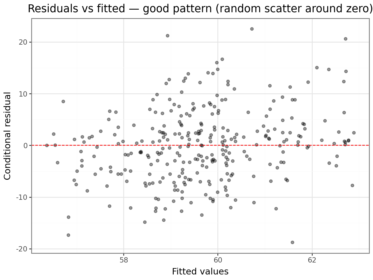
Residuals vs fitted values
A good plot shows points scattered randomly around zero with roughly constant spread. Any fan shape (wider spread at high fitted values) indicates heteroscedasticity; any curve indicates a missing non-linear term.
(
    ggplot(resid_df, aes(x="fitted", y="conditional"))
    + geom_point(alpha=0.4)
    + geom_hline(yintercept=0, linetype="dashed", color="red")
    + labs(
        x="Fitted values",
        y="Conditional residual",
        title="Residuals vs fitted — good pattern (random scatter around zero)",
    )
    + theme_bw()
)
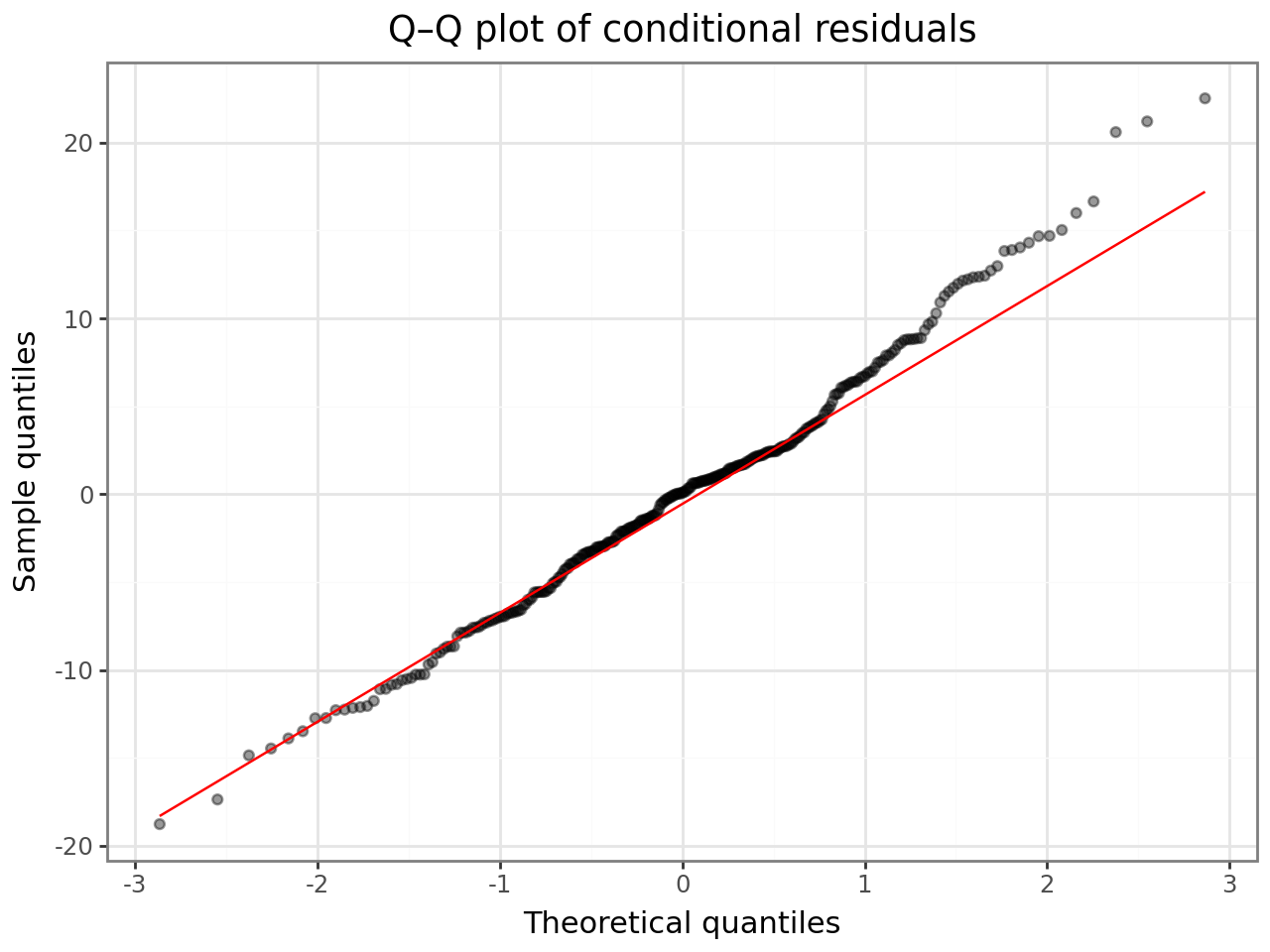
Q–Q plot
Points should fall on the diagonal. Heavy tails or an S-curve indicate departures from normality — consider a robustness check or a transformation.
(
    ggplot(resid_df, aes(sample="conditional"))
    + geom_qq(alpha=0.4)
    + geom_qq_line(color="red")
    + labs(
        x="Theoretical quantiles",
        y="Sample quantiles",
        title="Q–Q plot of conditional residuals",
    )
    + theme_bw()
)
2. Leverage
interlace.leverage() decomposes the hat-matrix diagonal into three parts following
Demidenko & Stukel (2005) and Nobre & Singer (2007):
Column |
Meaning |
|---|---|
|
Leverage due to the fixed-effect design matrix — unusual predictor values |
|
Leverage due to the random-effect structure (Demidenko & Stukel) |
|
Unconfounded H2 (Nobre & Singer) — H2 with fixed-effect contribution removed |
|
H1 + H2 — total leverage |
Interpretation:
High
fixefleverage: the observation has an unusual combination of predictors; it controls the slope estimates.High
ranefleverage: the observation strongly determines its group’s BLUP.A rule of thumb borrowed from OLS:
overall > 2p/n(wherep= number of fixed parameters,n= observations) flags potentially high-leverage points. In mixed models this is a heuristic — leverage is distributed differently — but it gives a starting threshold.
lev = leverage(result)
lev.head()
| overall | fixef | ranef | ranef.uc | |
|---|---|---|---|---|
| 0 | 0.013788 | 0.013788 | 0.0 | 0.0 |
| 1 | 0.012745 | 0.012745 | 0.0 | 0.0 |
| 2 | 0.006183 | 0.006183 | 0.0 | 0.0 |
| 3 | 0.006492 | 0.006492 | 0.0 | 0.0 |
| 4 | 0.006249 | 0.006249 | 0.0 | 0.0 |
p = len(result.fe_params)  # number of fixed-effect parameters
threshold = 2 * p / result.nobs

lev_plot_df = lev.reset_index(drop=True).assign(
    obs=range(len(lev)),
    high=lev["overall"] > threshold,
)

(
    ggplot(lev_plot_df, aes(x="obs", y="overall", color="high"))
    + geom_point(alpha=0.6)
    + geom_hline(yintercept=threshold, linetype="dashed", color="red")
    + scale_color_manual(values={True: "#e74c3c", False: "#2c3e50"})
    + labs(
        x="Observation index",
        y="Overall leverage (H1 + H2)",
        color="> 2p/n",
        title="Leverage plot — dashed line at 2p/n threshold",
    )
    + theme_bw()
)
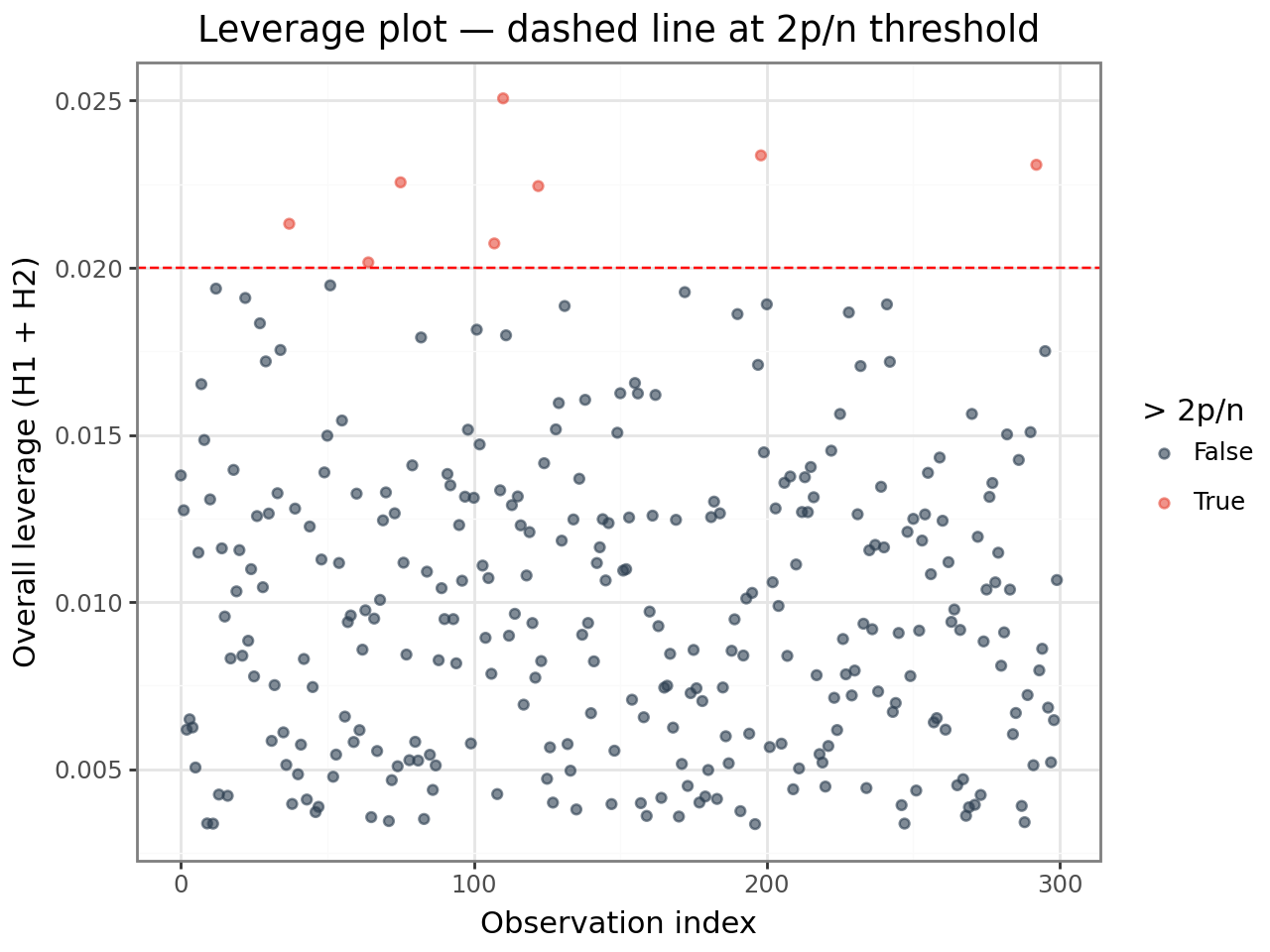
High leverage alone is not a problem — it means the observation could be influential. Combine leverage with residual size (next section) to identify observations that are both unusual and poorly fit.
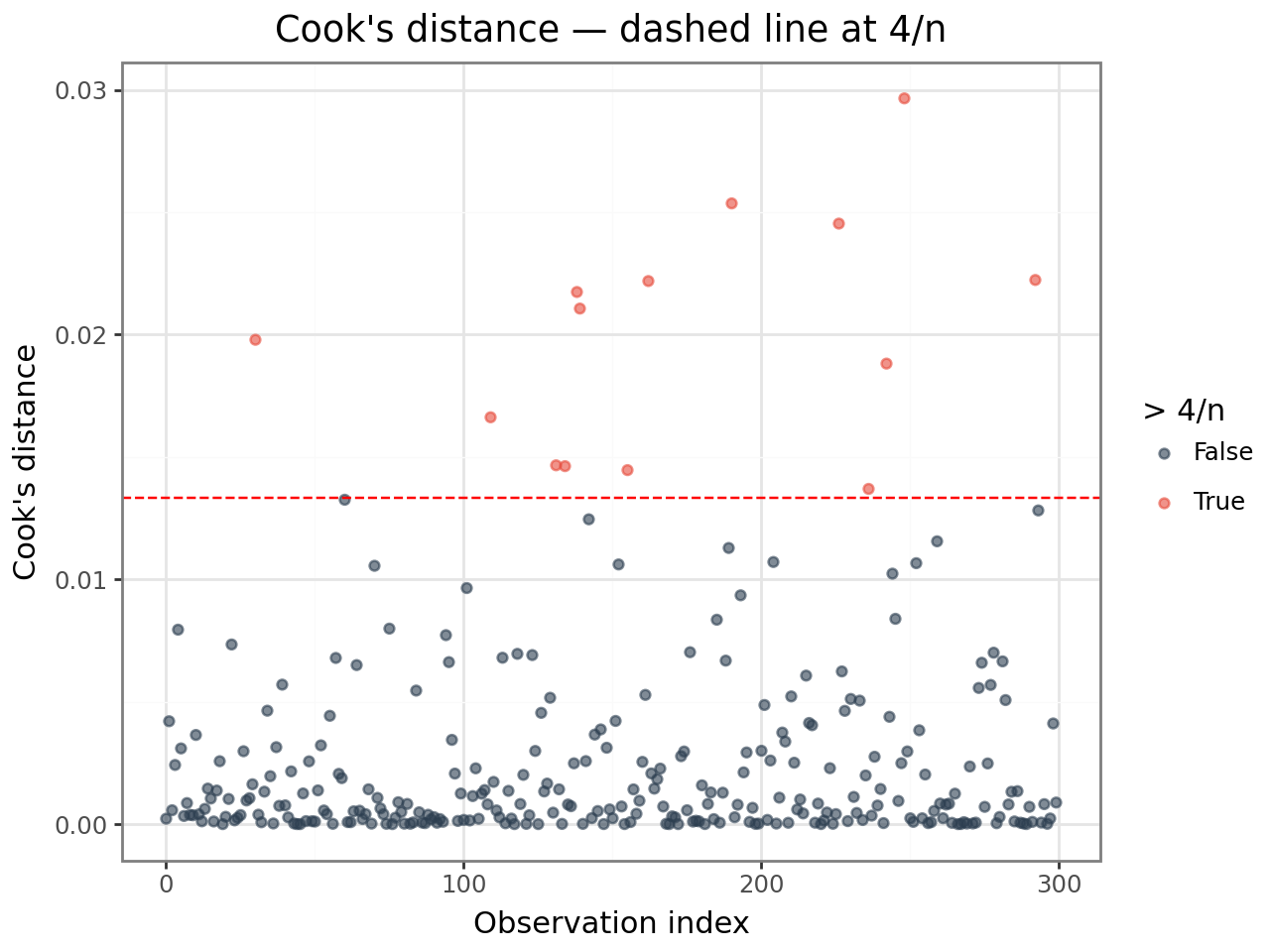
3. Cook’s distance
Cook’s distance (cooksd) measures how much the vector of fixed-effect estimates
changes when observation i is deleted. It combines residual size and leverage:
$$D_i = \frac{(\hat{\boldsymbol{\beta}} - \hat{\boldsymbol{\beta}}{(-i)})^\top (\mathbf{X}^\top \hat{\boldsymbol{\Omega}}^{-1} \mathbf{X}) (\hat{\boldsymbol{\beta}} - \hat{\boldsymbol{\beta}}{(-i)})} {p , \hat{\sigma}^2}$$
Thresholds (heuristics):
cooksd > 4/n— worth inspectingcooksd > 1— substantial influence on fixed-effect estimates
These thresholds are rules of thumb from OLS, applied here as starting points. Always inspect flagged observations in context before removing them.
infl = hlm_influence(result)
infl.head()
| index | cooksd | mdffits | covtrace | covratio | rvc.var_student_id | rvc.var_school_id | rvc.error_var | |
|---|---|---|---|---|---|---|---|---|
| 0 | 0 | 0.000222 | 0.000218 | 0.020765 | 1.020792 | 0.990402 | 1.003852 | 1.003852 |
| 1 | 1 | 0.004204 | 0.004155 | 0.010967 | 1.010955 | 0.997688 | 0.999976 | 0.999976 |
| 2 | 2 | 0.000567 | 0.000566 | -0.000107 | 0.999817 | 0.972197 | 1416.079363 | 1.003571 |
| 3 | 3 | 0.002417 | 0.002401 | 0.007117 | 1.007107 | 1.011942 | 4749.047760 | 0.998248 |
| 4 | 4 | 0.007945 | 0.007966 | -0.020203 | 0.979889 | 1.009273 | 0.987885 | 0.987885 |
n = result.nobs
cooksd_threshold = 4 / n

cooksd_df = infl[["cooksd"]].reset_index(drop=True).assign(
    obs=range(n),
    high=infl["cooksd"].values > cooksd_threshold,
)

(
    ggplot(cooksd_df, aes(x="obs", y="cooksd", color="high"))
    + geom_point(alpha=0.6)
    + geom_hline(yintercept=cooksd_threshold, linetype="dashed", color="red")
    + scale_color_manual(values={True: "#e74c3c", False: "#2c3e50"})
    + labs(
        x="Observation index",
        y="Cook's distance",
        color="> 4/n",
        title="Cook's distance — dashed line at 4/n",
    )
    + theme_bw()
)
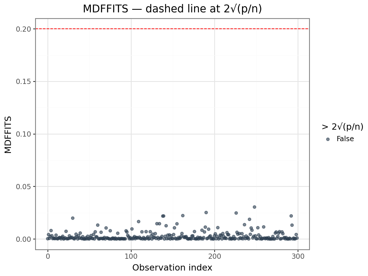
4. MDFFITS
MDFFITS (Measures of Difference in Fits) is a scale-free version of Cook’s distance.
It standardises by the full covariance matrix of the fixed effects rather than
by p * σ², so it is comparable across models with different numbers of parameters.
Threshold: mdffits > 2 * sqrt(p/n) is a common guideline.
MDFFITS and Cook’s D usually agree on which observations are influential; MDFFITS is
preferred when comparing across models or when σ² is poorly estimated.
mdffits_threshold = 2 * np.sqrt(p / n)

mdffits_df = infl[["mdffits"]].reset_index(drop=True).assign(
    obs=range(n),
    high=infl["mdffits"].values > mdffits_threshold,
)

(
    ggplot(mdffits_df, aes(x="obs", y="mdffits", color="high"))
    + geom_point(alpha=0.6)
    + geom_hline(yintercept=mdffits_threshold, linetype="dashed", color="red")
    + scale_color_manual(values={True: "#e74c3c", False: "#2c3e50"})
    + labs(
        x="Observation index",
        y="MDFFITS",
        color=f"> 2√(p/n)",
        title="MDFFITS — dashed line at 2√(p/n)",
    )
    + theme_bw()
)
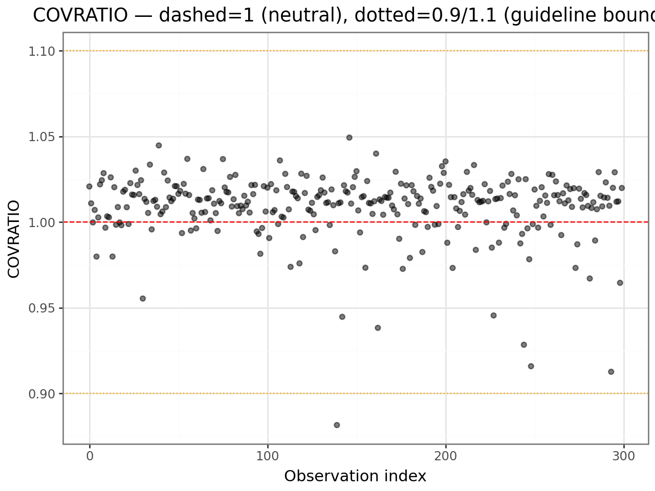
5. COVTRACE and COVRATIO
These diagnostics measure influence on the precision of fixed-effect estimates
(the covariance matrix V), not just on their values.
Measure |
Formula |
Interpretation |
|---|---|---|
|
tr(V⁻¹Vᵢ) − p |
Positive → deletion improves precision; negative → deletion hurts precision |
|
det(Vᵢ) / det(V) |
< 1 → deletion improves precision (det shrinks); > 1 → deletion hurts precision |
Here Vᵢ is the fixed-effect covariance matrix fitted without observation i, and p is the number of fixed parameters.
Thresholds:
|covtrace| > pis notablecovratiofar from 1 (say, < 0.9 or > 1.1) is worth checking
A large positive covtrace means observation i inflates standard errors — removing
it would make estimates more precise. Check whether it is an outlier or simply at an
extreme predictor value (high leverage).
cov_df = infl[["covtrace", "covratio"]].reset_index(drop=True).assign(
    obs=range(n),
)

(
    ggplot(cov_df, aes(x="obs", y="covratio"))
    + geom_point(alpha=0.5)
    + geom_hline(yintercept=1, linetype="dashed", color="red")
    + geom_hline(yintercept=0.9, linetype="dotted", color="orange")
    + geom_hline(yintercept=1.1, linetype="dotted", color="orange")
    + labs(
        x="Observation index",
        y="COVRATIO",
        title="COVRATIO — dashed=1 (neutral), dotted=0.9/1.1 (guideline bounds)",
    )
    + theme_bw()
)
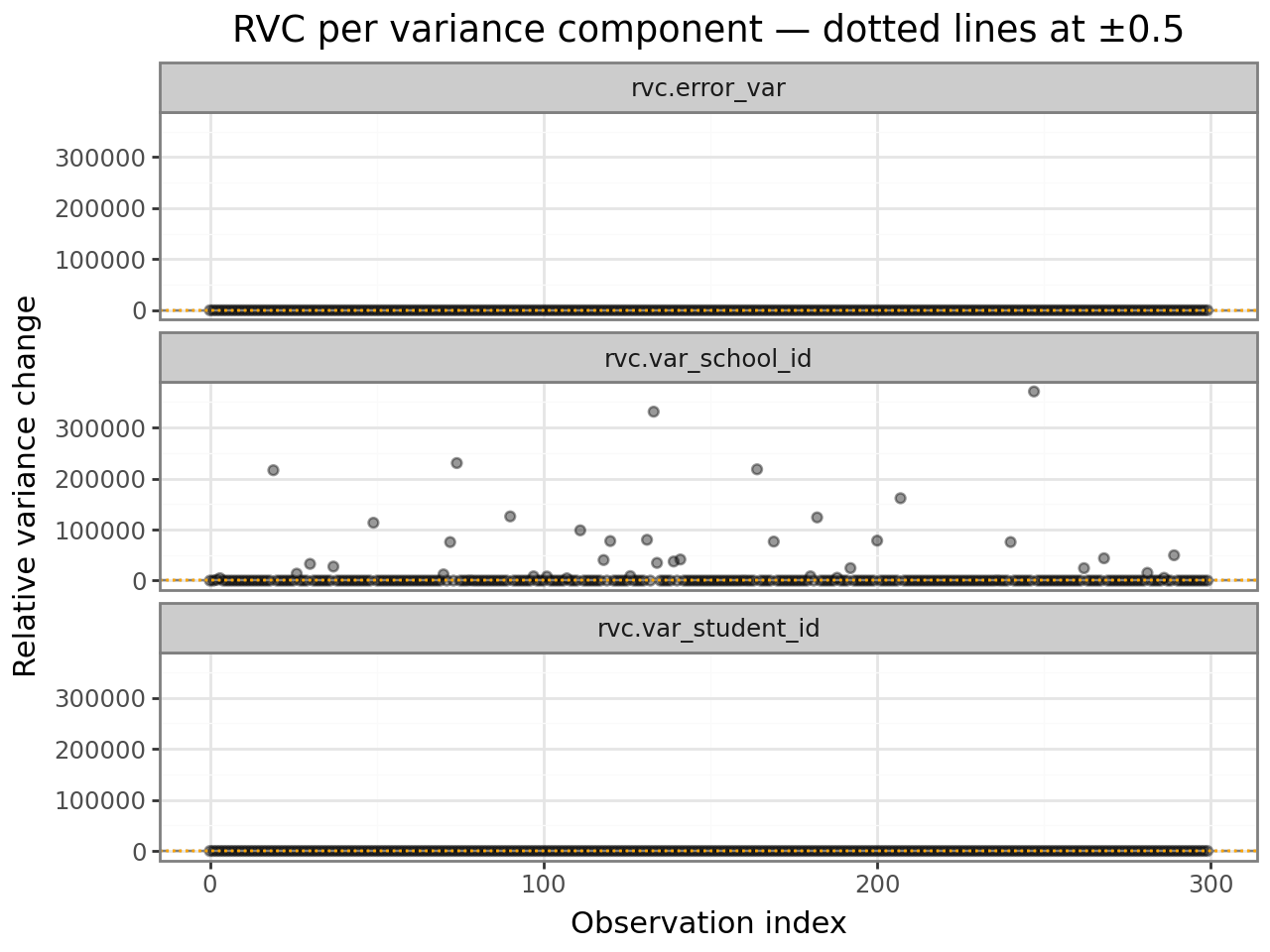
6. Relative variance change (RVC)
RVC columns (rvc.<name>) measure how much each variance component changes when
observation i is deleted, relative to the full-model estimate:
$$\text{RVC}i(\theta_k) = \frac{\hat{\theta}{k(-i)} - \hat{\theta}_k}{\hat{\theta}_k}$$
A value of +0.3 means the variance component increases by 30% when observation i is removed — that observation is suppressing variance in that grouping factor.
Threshold: |RVC| > 0.5 is a common guideline for flagging notable influence
on a specific variance component.
rvc_cols = [c for c in infl.columns if c.startswith("rvc.")]
rvc_df = (
    infl[rvc_cols]
    .reset_index(drop=True)
    .assign(obs=range(n))
    .melt(id_vars="obs", var_name="component", value_name="rvc")
)

(
    ggplot(rvc_df, aes(x="obs", y="rvc"))
    + geom_point(alpha=0.4)
    + geom_hline(yintercept=0,    linetype="dashed", color="grey")
    + geom_hline(yintercept= 0.5, linetype="dotted", color="orange")
    + geom_hline(yintercept=-0.5, linetype="dotted", color="orange")
    + facet_wrap("component", ncol=1)
    + labs(
        x="Observation index",
        y="Relative variance change",
        title="RVC per variance component — dotted lines at ±0.5",
    )
    + theme_bw()
)
7. hlm_augment — everything in one DataFrame
interlace.hlm_augment() appends all residual and influence diagnostics to your
original data. This makes it easy to filter, join, and plot.
Columns added:
Column |
Source |
|---|---|
|
Conditional residual |
|
Marginal residual |
|
Conditional fitted value |
|
Overall leverage (H1 + H2) |
|
Cook’s distance |
|
MDFFITS |
|
COVTRACE |
|
COVRATIO |
|
RVC per variance component |
aug = hlm_augment(result)
aug.head()
| score | hours_studied | prior_gpa | student_id | school_id | .resid | .fitted | index | cooksd | mdffits | covtrace | covratio | rvc.var_student_id | rvc.var_school_id | rvc.error_var | |
|---|---|---|---|---|---|---|---|---|---|---|---|---|---|---|---|
| 0 | 62.437737 | 2.325699 | 3.939630 | s24 | sch8 | 1.356258 | 61.081478 | 0 | 0.000222 | 0.000218 | 0.020765 | 1.020792 | 0.990402 | 1.003852 | 1.003852 |
| 1 | 51.680127 | 3.675118 | 3.969156 | s28 | sch3 | -7.093567 | 58.773694 | 1 | 0.004204 | 0.004155 | 0.010967 | 1.010955 | 0.997688 | 0.999976 | 0.999976 |
| 2 | 66.003610 | 3.663924 | 2.576456 | s4 | sch4 | 4.195162 | 61.808448 | 2 | 0.000567 | 0.000566 | -0.000107 | 0.999817 | 0.972197 | 1416.079363 | 1.003571 |
| 3 | 67.524518 | 3.274956 | 3.467507 | s30 | sch7 | 8.050473 | 59.474044 | 3 | 0.002417 | 0.002401 | 0.007117 | 1.007107 | 1.011942 | 4749.047760 | 0.998248 |
| 4 | 44.391718 | 3.794641 | 3.499967 | s19 | sch1 | -14.461164 | 58.852882 | 4 | 0.007945 | 0.007966 | -0.020203 | 0.979889 | 1.009273 | 0.987885 | 0.987885 |
# Flag any observation that exceeds both the leverage and Cook's D thresholds.
# Leverage comes from leverage(); influence diagnostics from hlm_augment().
aug["leverage"] = leverage(result)["overall"].to_numpy()
aug["influential"] = (
    (aug["leverage"] > 2 * p / n) &
    (aug["cooksd"]   > 4 / n)
)

print(f"Observations flagged as influential: {aug['influential'].sum()} of {len(aug)}")
aug[aug["influential"]][["student_id", "school_id", "score", "leverage", "cooksd"]].head()
Observations flagged as influential: 1 of 300
| student_id | school_id | score | leverage | cooksd | |
|---|---|---|---|---|---|
| 292 | s29 | sch7 | 71.771936 | 0.023081 | 0.022232 |
8. Worked example — introducing an outlier
To see how the diagnostics respond to a genuine outlier, we refit the model after injecting a single extreme observation.
# Inject one outlier: extreme score and unusual predictor values
outlier = pd.DataFrame([{
    "score":         120.0,   # far above the ~60-point mean
    "hours_studied": 0.1,     # almost no study time
    "prior_gpa":     2.0,     # lowest GPA
    "student_id":    "s1",
    "school_id":     "sch1",
}])

df_outlier = pd.concat([df, outlier], ignore_index=True)
result_outlier = interlace.fit(
    "score ~ hours_studied + prior_gpa",
    data=df_outlier,
    groups=["student_id", "school_id"],
)

print("Without outlier — hours_studied coefficient:", round(result.fe_params["hours_studied"], 3))
print("With outlier    — hours_studied coefficient:", round(result_outlier.fe_params["hours_studied"], 3))
Without outlier — hours_studied coefficient: 0.033
With outlier    — hours_studied coefficient: -0.1
/tmp/ipykernel_2472/781280852.py:11: UserWarning: boundary (singular) fit: see help(interlace.isSingular)
infl_outlier = hlm_influence(result_outlier)
n2 = result_outlier.nobs

cooksd_out_df = infl_outlier[["cooksd"]].reset_index(drop=True).assign(
    obs=range(n2),
    is_outlier=(range(n2) == n2 - 1),  # last row is the injected outlier
)
# label the injected outlier
cooksd_out_df["label"] = cooksd_out_df.apply(
    lambda r: "injected\noutlier" if r["is_outlier"] else "", axis=1
)

(
    ggplot(cooksd_out_df, aes(x="obs", y="cooksd", color="is_outlier"))
    + geom_point(alpha=0.6)
    + geom_hline(yintercept=4 / n2, linetype="dashed", color="red")
    + geom_text(
        data=cooksd_out_df[cooksd_out_df["is_outlier"]],
        mapping=aes(label="label"),
        nudge_x=-8, nudge_y=0,
        size=9,
    )
    + scale_color_manual(values={True: "#e74c3c", False: "#2c3e50"})
    + labs(
        x="Observation index",
        y="Cook's distance",
        color="Injected outlier",
        title="Cook's distance after injecting an outlier — outlier is clearly detected",
    )
    + theme_bw()
)
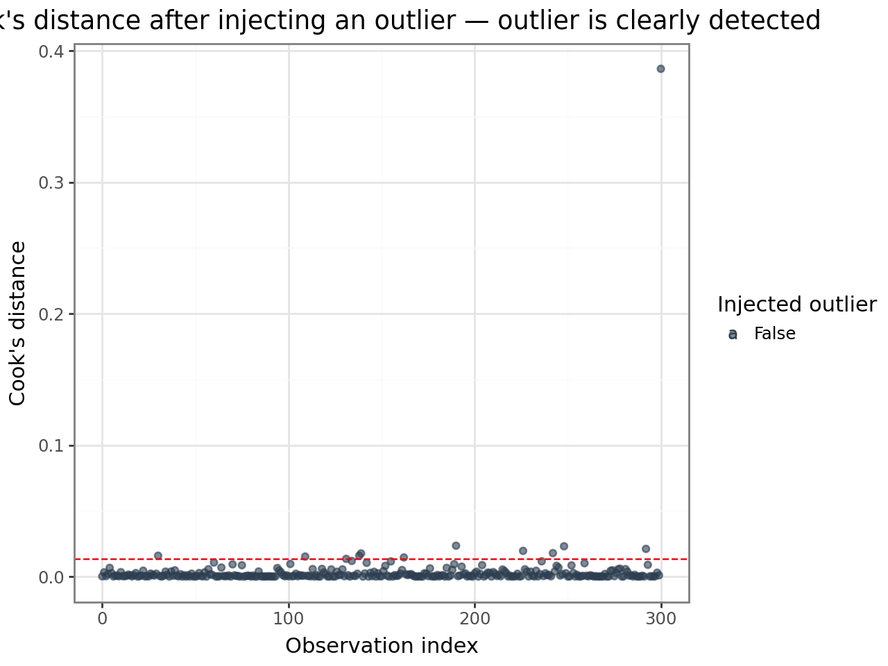
The injected observation stands out dramatically. Compare its diagnostic values to the rest of the dataset:
aug_outlier = hlm_augment(result_outlier)
aug_outlier["leverage"] = leverage(result_outlier)["overall"].to_numpy()

diag_cols = ["leverage", "cooksd", "mdffits", "covtrace", "covratio"]
pd.concat([
    aug_outlier[diag_cols]
    .describe()
    .loc[["mean", "max"]]
    .rename(index={"mean": "dataset mean", "max": "dataset max"}),
    aug_outlier.iloc[[-1]][diag_cols]
    .rename(index={n2 - 1: "injected outlier"}),
]).round(4)
| leverage | cooksd | mdffits | covtrace | covratio | |
|---|---|---|---|---|---|
| dataset mean | 0.0100 | 0.0036 | 0.0039 | 0.0085 | 1.0089 |
| dataset max | 0.0257 | 0.3864 | 0.4575 | 0.0650 | 1.0650 |
| injected outlier | 0.0257 | 0.3864 | 0.4575 | -0.5424 | 0.5484 |
9. lmer_influence_measures() — HLMdiag-parity all-in-one
lmer_influence_measures() combines case-deletion diagnostics, analytical
leverage, and DFBETAS into a single dict that matches R’s
HLMdiag::hlm_influence output exactly. Use it when you need full R parity
or when you want all measures in one call.
For large models, pass n_jobs=-1 to parallelise the case-deletion loop
across all available CPUs (Linux: fork, fast; macOS/Windows: spawn, slower).
from interlace.influence import lmer_influence_measures

# n_jobs=1 (default) is sequential; n_jobs=-1 uses all CPUs
measures = lmer_influence_measures(result, n_jobs=1, show_progress=False)
print(list(measures.keys()))
# ['cooks', 'hat', 'hat_overall', 'hat_fixef', 'dfbetas', 'dffits', 'residuals', 'sigma']
['cooks', 'hat', 'hat_overall', 'hat_fixef', 'dfbetas', 'dffits', 'residuals', 'sigma']
# Use the correct hat vector for flagging (matches R's HLMdiag convention)
# - hat_fixef (H1 only) for crossed multi-RE models
# - hat_overall (H1+H2) for single-RE models
n = result.nobs
p = len(result.fe_params)

cooksd_thresh   = 4 / n
leverage_thresh = 2 * p / n

flag_cooksd   = measures['cooks']   > cooksd_thresh
flag_leverage = measures['hat']     > leverage_thresh
flag_both     = flag_cooksd & flag_leverage

print(f"Influential (Cook's D): {flag_cooksd.sum()}")
print(f"High leverage:          {flag_leverage.sum()}")
print(f"Both:                   {flag_both.sum()}")
Influential (Cook's D): 14
High leverage:          8
Both:                   1
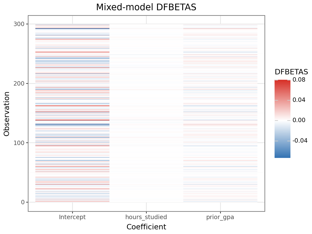
DFBETAS from lmer_influence_measures
The 'dfbetas' key contains an analytical DFBETAS matrix (n, p) using the
same formula as R. This is faster than case-deletion-based DFBETAS and
matches HLMdiag’s values:
import pandas as pd
from plotnine import ggplot, aes, geom_tile, scale_fill_gradient2, theme_bw, labs

dfbetas = measures['dfbetas']   # shape (n, p)
threshold = 2 / np.sqrt(n)

dfbetas_df = (
    pd.DataFrame(dfbetas, columns=result.fe_params.index)
    .assign(obs=range(n))
    .melt(id_vars='obs', var_name='coefficient', value_name='dfbetas')
)

(
    ggplot(dfbetas_df, aes(x='coefficient', y='obs', fill='dfbetas'))
    + geom_tile()
    + scale_fill_gradient2(low='#2166ac', mid='white', high='#d73027', midpoint=0)
    + theme_bw()
    + labs(title='Mixed-model DFBETAS', x='Coefficient', y='Observation', fill='DFBETAS')
)
9. OLS DFBETAS — coefficient-level influence for OLS models
DFBETAS measure how much each regression coefficient changes (in units of its standard error) when a single observation is removed. Unlike Cook’s distance — which summarises influence on all coefficients simultaneously — DFBETAS give a per-coefficient, per-observation breakdown.
ols_dfbetas_qr() computes DFBETAS for a statsmodels OLS model via QR
decomposition: fully vectorised, no Python loops.
When to use:
As a pre-check before fitting the mixed model (stage-1 diagnostics)
In two-stage workflows where OLS is used on group-level summaries
When you need to know which coefficient an influential observation drives
from interlace.influence import ols_dfbetas_qr
import statsmodels.formula.api as smf

# Fit an OLS model on the same dataset
ols = smf.ols("score ~ hours_studied + prior_gpa", data=df).fit()

# Compute DFBETAS — shape (n_obs, n_params)
dfbetas = ols_dfbetas_qr(ols)
print(f"DFBETAS shape: {dfbetas.shape}")
print(f"Columns correspond to: {ols.model.exog_names}")
DFBETAS shape: (300, 3)
Columns correspond to: ['Intercept', 'hours_studied', 'prior_gpa']
# Rule-of-thumb threshold: 2 / sqrt(n)
threshold = 2 / np.sqrt(result.nobs)
influential_mask = np.any(np.abs(dfbetas) > threshold, axis=1)
print(f"Threshold: {threshold:.3f}")
print(f"Observations exceeding threshold on at least one coefficient: {influential_mask.sum()}")
Threshold: 0.115
Observations exceeding threshold on at least one coefficient: 33
Heatmap visualisation
A heatmap shows the full DFBETAS matrix at a glance. Rows are observations, columns are coefficients. Dark cells indicate high influence on that coefficient.
dfbetas_df = (
    pd.DataFrame(dfbetas, columns=ols.model.exog_names)
    .assign(obs=range(len(dfbetas)))
    .melt(id_vars="obs", var_name="coefficient", value_name="dfbetas")
)

from plotnine import ggplot, aes, geom_tile, scale_fill_gradient2, theme_bw, labs

(
    ggplot(dfbetas_df, aes(x="coefficient", y="obs", fill="dfbetas"))
    + geom_tile()
    + scale_fill_gradient2(low="#2166ac", mid="white", high="#d73027", midpoint=0)
    + theme_bw()
    + labs(title="OLS DFBETAS", x="Coefficient", y="Observation", fill="DFBETAS")
)
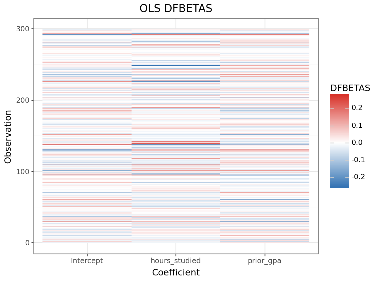
Observations with large absolute DFBETAS for a coefficient are driving that coefficient’s estimate. The same observations may or may not be flagged by Cook’s distance — DFBETAS can reveal influence on a single coefficient that is diluted in the Cook’s D summary.
Note that ols_dfbetas_qr() operates on OLS models only. For mixed-model
influence at the coefficient level, use hlm_influence() and examine the
mdffits column, which is the multivariate analogue.
Acting on diagnostic results
Diagnostics answer the question is my model adequate? Below is a decision workflow for the most common findings.
Residual patterns suggest model misspecification
Pattern |
Likely cause |
Action |
|---|---|---|
Fan shape (variance increases with fitted) |
Heteroscedasticity |
Transform response (log/sqrt) or consider GLMM |
Curve in residual-vs-fitted |
Missing non-linear term |
Add polynomial or interaction term |
Heavy tails in Q-Q plot |
Non-normal errors |
Check for data errors; consider robust estimation |
Systematic trend by group |
Missing random slope |
Fit a random slope for that predictor |
Checking for a missing random slope: If conditional residuals show a systematic trend with a predictor within groups, a random slope may be warranted:
# Refit with a by-student random slope for hours_studied
result_slopes = interlace.fit(
    "score ~ hours_studied + prior_gpa",
    data=df,
    random=["(1 + hours_studied | student_id)", "(1 | school_id)"],
)
# Then compare with LRT — see model-comparison.md
High leverage + high Cook’s D: influential observation
Steps:
Identify:
aug[aug[".cooksd"] > 4/n]Check for data errors (typos, unit mismatches)
Refit without the observation and compare fixed-effect estimates
If estimates change substantially, report both models
aug = hlm_augment(result, data=df)
drop_idx = aug[".cooksd"].idxmax()

result_sens = interlace.fit(
    "score ~ hours_studied + prior_gpa",
    data=df.drop(index=drop_idx),
    groups=["student_id", "school_id"],
)
print("Original:", result.fe_params.round(3).to_dict())
print("Without obs", drop_idx, ":", result_sens.fe_params.round(3).to_dict())
High RVC: influential observation for a variance component
Large rvc.<name> often occurs when a group has very few observations (especially singletons). This is expected. Check group sizes:
print(df.groupby("student_id").size().sort_values())
# Groups with n=1 will always have high RVC — treat their BLUPs with caution
Diagnostic thresholds — quick reference
Diagnostic |
Guideline threshold |
What it flags |
|---|---|---|
Overall leverage |
> 2p/n |
Unusual predictor values |
Cook’s distance |
> 4/n or > 1 |
Influence on fixed-effect estimates |
MDFFITS |
> 2√(p/n) |
Scale-free fixed-effect influence |
COVTRACE |
|value| > p |
Influence on fixed-effect precision |
COVRATIO |
< 0.9 or > 1.1 |
Influence on covariance determinant |
RVC |
|value| > 0.5 |
Influence on a specific variance component |
All thresholds are heuristics. An observation that exceeds a threshold is worth inspecting, not automatically removed. Ask:
Is it a data-entry error?
Is it a legitimate extreme value that the model should fit?
Does removing it change your substantive conclusions?
If removal does not change conclusions, the result is robust. If it does, report both analyses and discuss the influential case.
Where to go next
Interpreting model results — reading fixed effects, variance components, and BLUPs
Influence diagnostics —
hlm_influence,cooks_distance,mdffits,n_influentialLeverage —
leveragedecomposition columnsAugment —
hlm_augmentcolumn referenceResiduals —
hlm_residlevel parameterFAQ & Troubleshooting — convergence issues and numerical stability